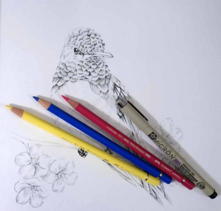
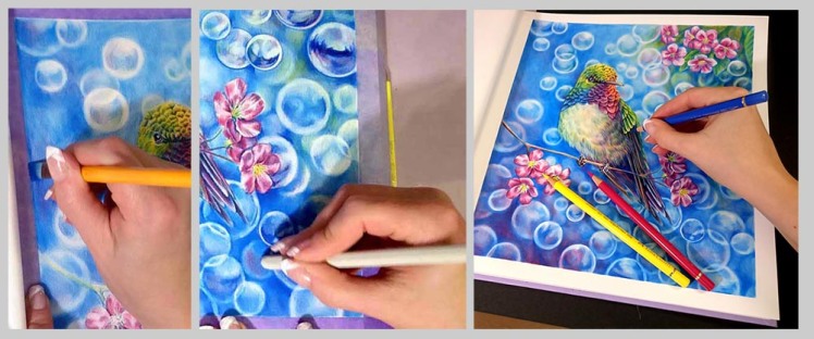
I decided to do little color study and use only 3 primary color for coloring this hummingbird. How many colors and shades you can achieve using only 3 pencils?
And yes, I used Pigma Micron pen for those outlines, but other than that and Caran d’Ache colorless full blender pencil, I used only these three Faber-Castell Polychromos pencils: Pink Carmine (127), Cobalt blue – Greenish (144) and Light Chrome Yellow (106). I actually am not so sure if those exact colors are the “right primaries”. I deliberately choose a bit colder red and colder yellow, so that I would get nice bright greens and purples when mixing with blue.
I also added this hummingbird drawing in my coloring picture page, so you can go and get that to yourself.
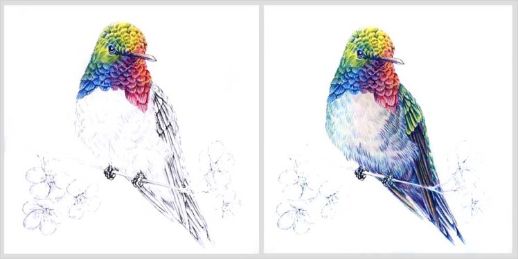
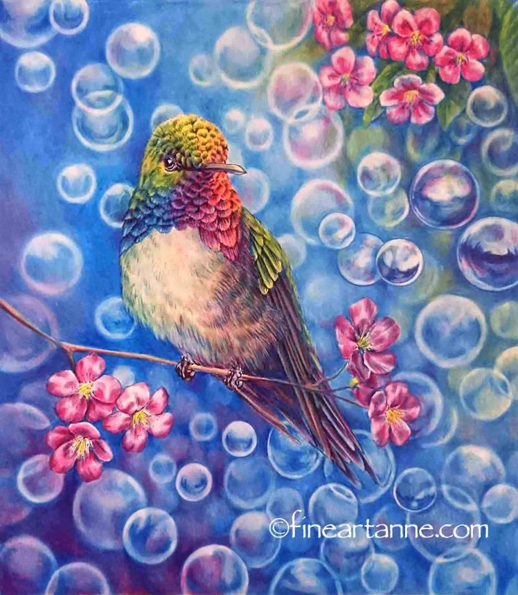
First I did traditional color wheel kind of coloring in birds head. Yellow on top and blue and red on the other tips of the triangle and then made the secondary colors between them just to get a hang of what these pencils could do.
I really like how well these Polychromos pencils lay on top of each other. Layering with these is so easy and you can layer them almost indefinitely.
Next I did the body and tested how well I could do really light, almost grey tone chest to the bird and also brownish feathers to the wings. Getting the grey tone was quite impossible with these colors, as vibrant as they are, but the brown effect went surprisingly well. In this photo you can’t see the effect as well as it is in real life.
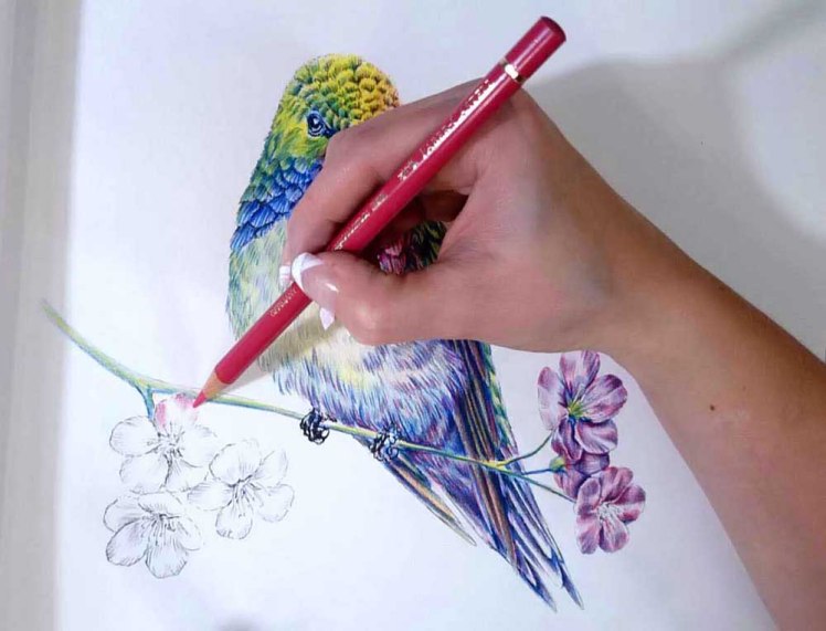
Then there was those flowers. I knew already that I would face a problem when trying to get those petals light enough. I really missed my white in this point, but still I didn’t want to just go easy and do those petals dark purplish red. Yet they did get a bit too dark than what was my intention. I added blue for shadows and that went really dark really quick. But overall I was quite happy how those turned out.
With the background, first I was going to do it just solid blue, but I have my weakness. It’s called bubble! I found a circle stencil and just couldn’t help my self! Bubbles, bubbles, so many bubbles. And I had so much fun!
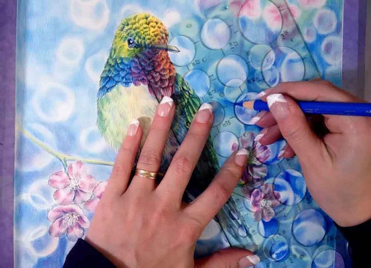
One of my problems while doing this, was how to get rid of the paper texture so it wouldn’t show up so roughly. I couldn’t add pressure or those colors would get too dark and just lightly adding more color just didn’t do any good. In this kind of situations you could either use other lighter color and add little more pressure for the pen, but as I was using only those tree colors and only white I could use was the paper itself, I had to blend the colors other way.
I had two option, either odorless paint thinner, the same you use with oil painting, or colorless blending pencil. I decided to first use the paint thinner since those blending pencils can get paper to smooth out too much preventing future layers. Normally I put much more layers of color before blending with paint thinner, but I didn’t want my drawing to get too dark. The best way to blend with paint thinner is to lightly tap with stiff paint brush so that the brush pushes the colors from top of the paper structure to those little grooves. Paper structure is like mountains, hills and valleys and when you color with light hand, the color builds up on top of those hills and the white you see is the white valleys of the paper. By blending with paint thinner you push that color down those hills and cover white areas. Other way is burnishing by adding pressure to your pencil and push the color in those valleys, but problem with this is that pressing too mush you smooth the tooth of your paper and it gets too slick for future color layers to stick in. That’s why I used first paint thinner and only in last layers my blending pencil. Blending pencil I used was Caran d’Ache colorless full blender pencil.
And here is the finished picture. Overall this was really fun little experiment. There is surprisingly much you can do with only handful of good quality pencils. By layering you can create so many different colors and shades. I would say that with handful basic colors and good black and white pencil, you can create so many different looks. This color palette I used here gave really cartoonish look in this and I would really have had hard time to get more muted colors out from these. I don’t say it is not possible, I actually don’t know since I’m also quite new with these kind of color experiments, but to me it would had been really hard. Maybe I will try that too some day. A bit more challenge.
Here is Time-lapse video of this little project.

I don’t think it’s cartoonish at all Anne. It’s beautiful. You have such a wonderful talent with colors and styles. Your bubbles are gorgeous!! Xxx
LikeLiked by 1 person
Thank you so much! That kind of really vibrant colors tend to have fantasy or cartoonish look in them, but heck! That is kind of fantasy bird after all. Let him live in really colorful world! 😀
LikeLike
thanks for sharing – I love what you done and look forward to trying it out
LikeLiked by 1 person
Hermoso gracias por compartir
LikeLike